WisdomTree Prime - Make wealth accessible through blockchain
What people actually needed
After aligning on business goals through workshops, we had 3 weeks to validate our assumptions with US users. I led qualitative interviews and surveys around two core questions:
- How do people in the US think about financial freedom?
- Would they adopt blockchain-based tools to manage their wealth?
From 9 boards of research observations to focused feature requirements - mapping what users actually needed to what we'd build
What we kept hearing
- "I have to switch between several apps" → fragmented experience across banks, brokerages, and payment apps
- "Every app has different restrictions" → KYC limits, trading permissions, can't move money freely
- "I don't know what's trustworthy" → financial + crypto jargon creating confusion
- "No trial phase with banks" → lengthy onboarding with no way out
People weren't excited about blockchain or tokenization - they were frustrated with their current financial setup. This finding shifted our entire approach. We stopped designing a "digital wallet" and started designing a personal finance app that happens to use blockchain. The technology should be invisible - users just wanted their money to work better.
Defining the experience
From research insight to strategy: I needed to give users the traditional investing experience they were familiar with - with the benefits of tokenization. This meant analyzing how legacy investing apps work, understanding the patterns people already know, and abstracting away blockchain entirely from the UI.
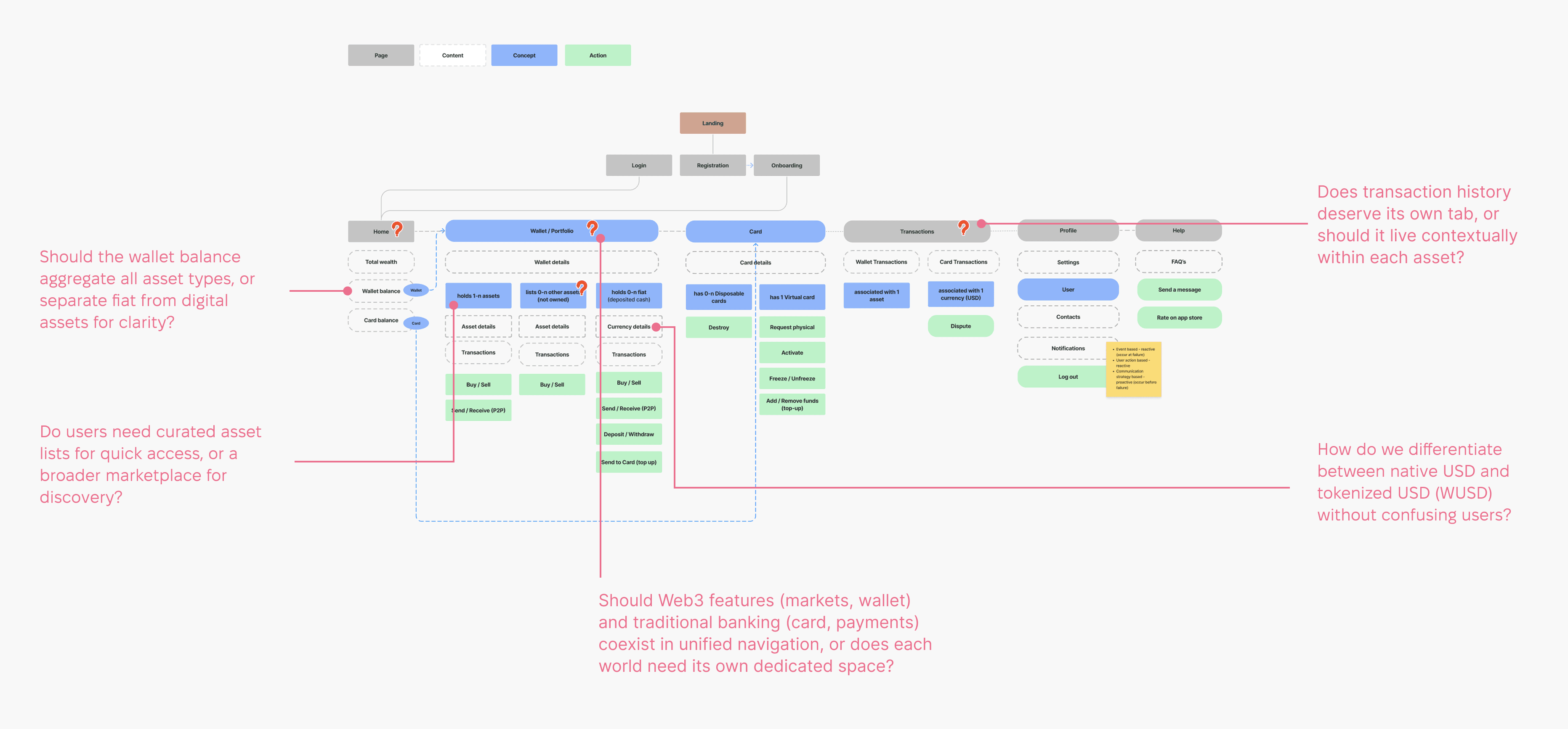
Defining the app structure and working through key questions
Moving from structure to actual UI surfaced specific challenges where "abstracting complexity" became concrete design problems. Below are the key design areas I explored - each direction went through iterations and was refined into stronger, more intuitive solutions.
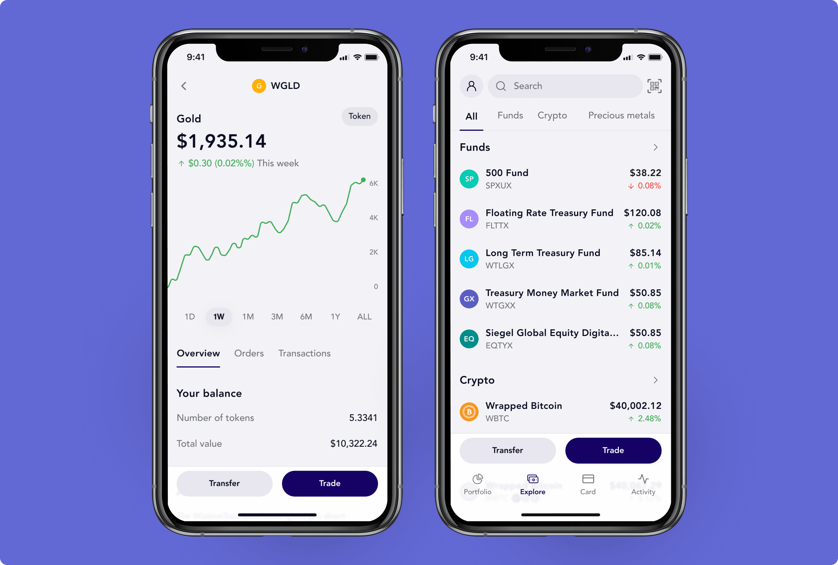
The "zero-balance" dilemma
The blockchain required something called a "Trustline" - a permission that allows a wallet to hold a specific asset. To avoid friction, we automatically established Trustlines for core assets (Bitcoin, Gold, USD tokens) during onboarding so users could buy and receive them immediately. But should users see these zero-balance assets in their portfolio?
Idea 1: "Show me what I can buy" model
Initially, we showed all assets in the wallet with $0 balances - mirroring traditional banking where you see accounts before you fund them.
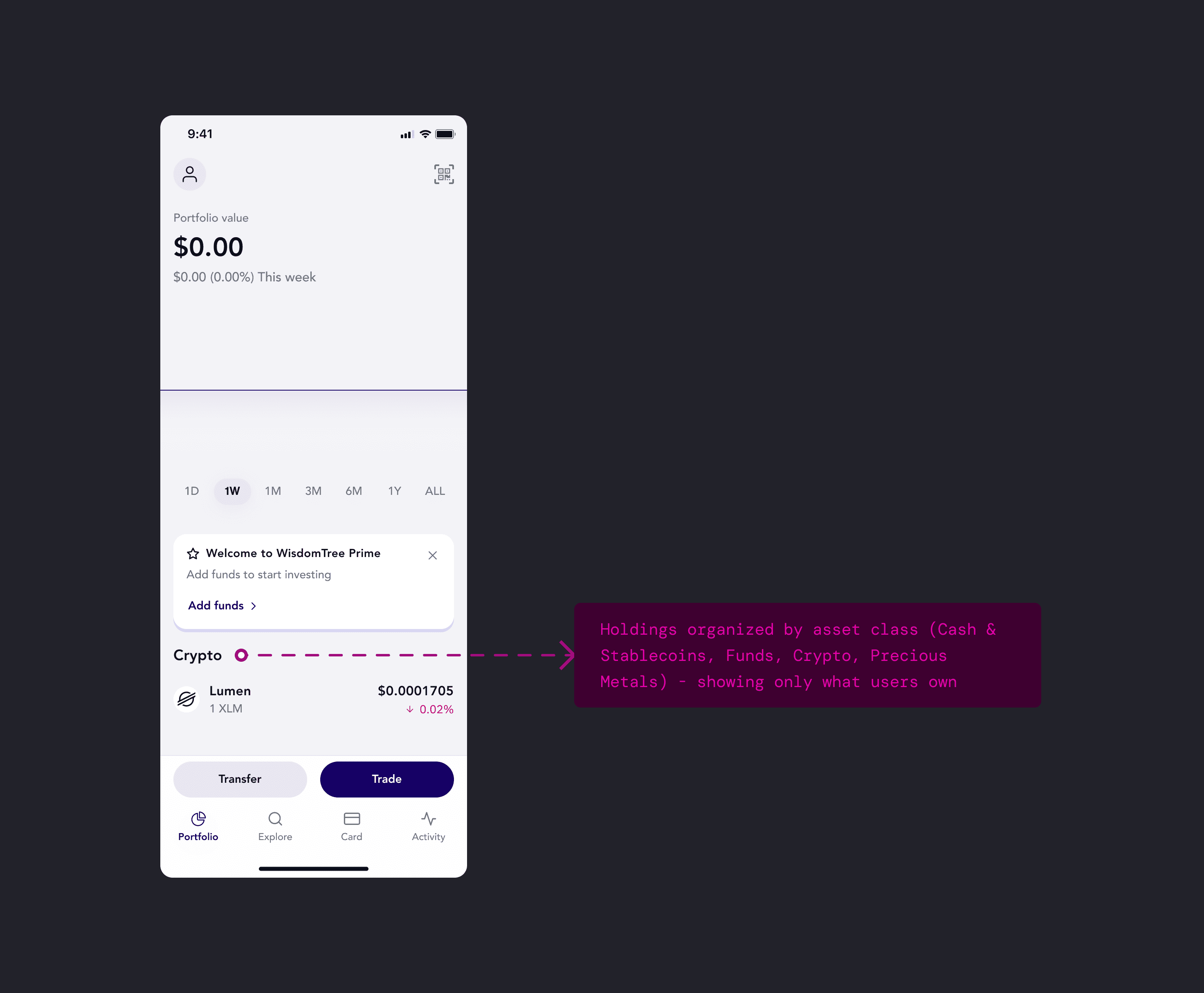
Idea 2: "Show me what I own" model
The solution: hide zero-balance assets and show only what users actually own. I went a step further and organized holdings into categories (Cash & Stablecoins, Funds, Crypto, Precious Metals) rather than one flat list. This kept the portfolio clean and scannable, while the technical Trustline setup happened invisibly in the background.
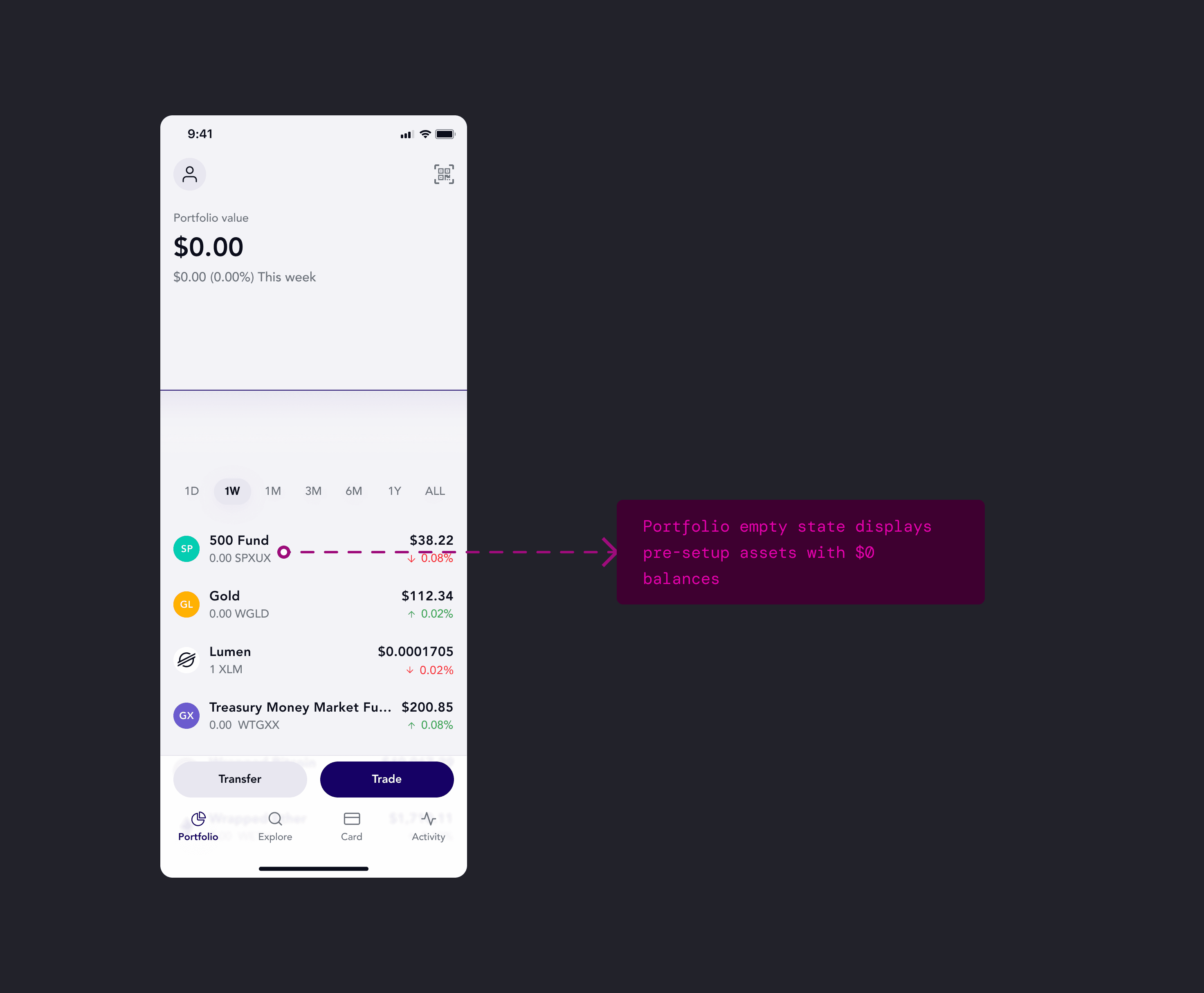
Zero balances hidden, assets grouped by class — matching how investors think about risk and diversification.
Crafting the Send flow
In-person testing of the send funds flow showed a gap: users were questioning "where's the scan QR code?". The QR scanner was nested inside the Send option, but users didn't think to look there. This meant one send screen had to accommodate different starting contexts - pasting addresses, scanning QR codes, selecting saved contacts, and saving new contacts if needed.
Testing insights
Technical function ≠ user entry point. "Scan" and "Send" both resulted in an outgoing payment but users thought about them differently:
- Send: "I'm at home, I want to send money to someone" → app-first.
- Scan QR: "I'm at a cafe, my friend is showing me their code" → world-first.
I revamped the Send feature to surface these different entry points, supporting multiple ways users might initiate a payment - whether they're at home browsing their contacts, standing in front of someone showing their QR code, or pasting an address from another app. I explored four architectural patterns to solve this.
Idea 1: Contact list-first approach
Design around the mental model: "I'm sending to people I know." It prioritized saved contacts to reduce errors, with an option to add new ones. While it encouraged using verified contacts, it created friction for the "cafe scenario" where users need to scan a QR code immediately. The page also offered too many competing actions - search, contact selection, QR scanning, or manual entry - resulting in high cognitive load.
Combining search, contact selection, and QR scanning into one view forced users to process too many competing entry points before acting.
Idea 2: Two tabs (Account ID / My contacts)
Tabs to separate two distinct user intents: "I'm entering data" in Account IDs tab versus "I'm picking a person" in My contacts. This structure provided clarity and allowed the UI to evolve - potentially defaulting to "Account ID" for new users and switching to "My Contacts" as their list grew.
Tabs provided great clarity and scalability, but the forced choice between "Data" and "People" still felt like a barrier to a seamless flow.
Idea 3: Single input field with embedded actions
One field for pasting an ID, with embedded icons for the contact list and QR scanner. This model aimed for a minimalist aesthetic - keeping the screen "quiet" so users wouldn't have to worry about being in the wrong tab. It mirrored familiar patterns like a browser search bar or Mac's Spotlight, where one input handles everything.
The simplified omni-field prioritized a clean look over the need for quick access to frequent contacts.
Idea 4: Adaptive contact list with payment link
After testing previous options, I learned users expected to see saved contacts prominently but also needed quick access to scan QR codes for the "cafe scenario." Adding new contacts wasn't a primary goal here, so I removed it to declutter the UI and focus on primary actions: choose contact or scan. We also realized that to drive adoption and bypass the app-install barrier, we had to let users send to non-WT users. Adding "Payment link" solved this - recipients could claim funds through a shareable link.
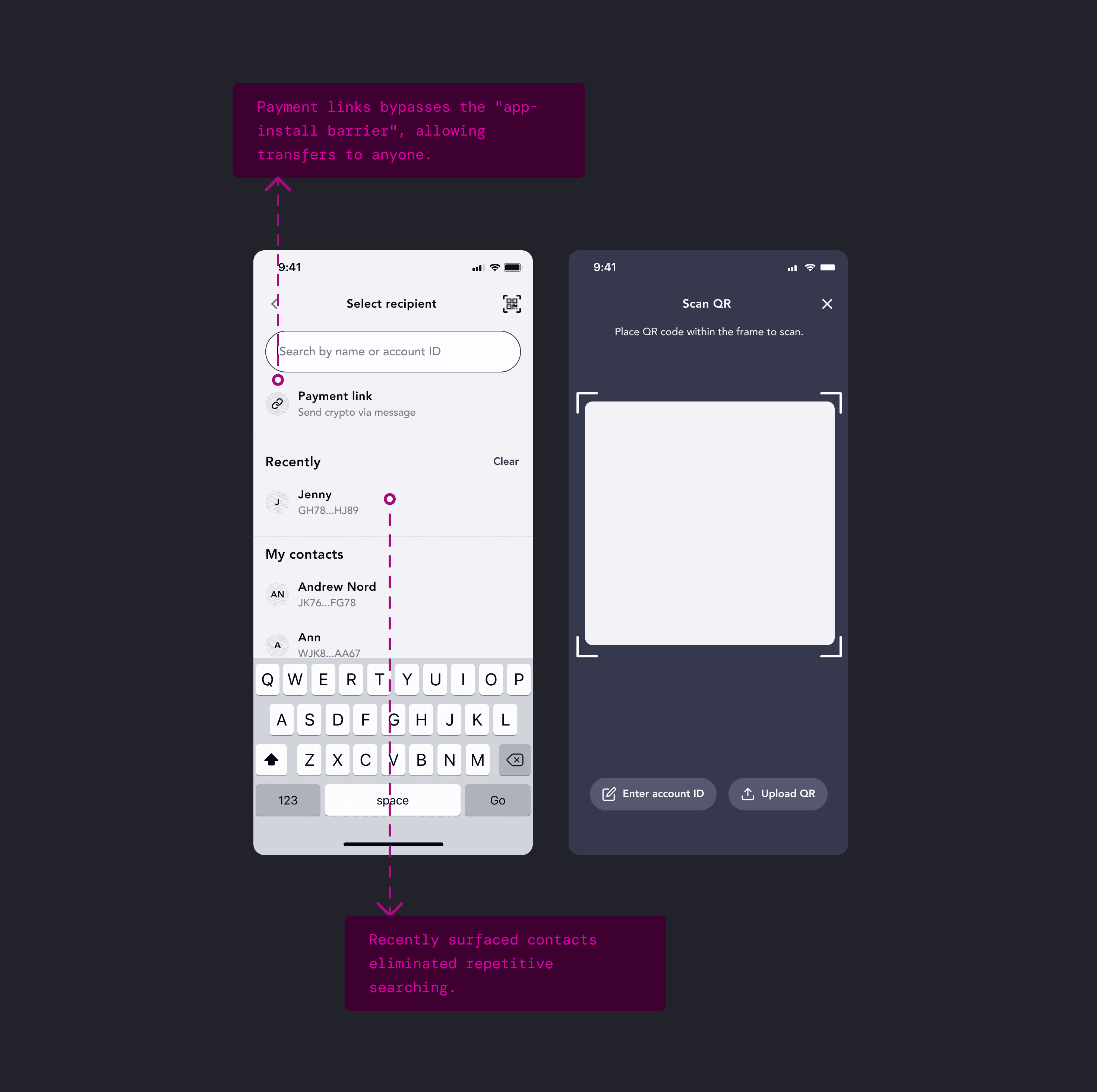
Adaptive list shows recent contacts first, keeps QR scanner accessible, and adds payment links to enable sending to non-WT users.
Single-asset transfers over complexity
Initial requirements let users send one asset while the recipient received a different one - send Gold, receive USDC. The backend could handle the conversion mid-transaction. But would users actually want this? Or would they just get USDC first, then send? Two simple steps instead of one complex one. During testing, we learned users had a strong preference for simplicity.
What users said
- "I'm confused why there are two different currencies involved. Isn't it just sending an asset to someone?"
- "It looks like I'm buying gold with USD and sending it at the same time...Why?"
- "I would first buy the asset before I send it"
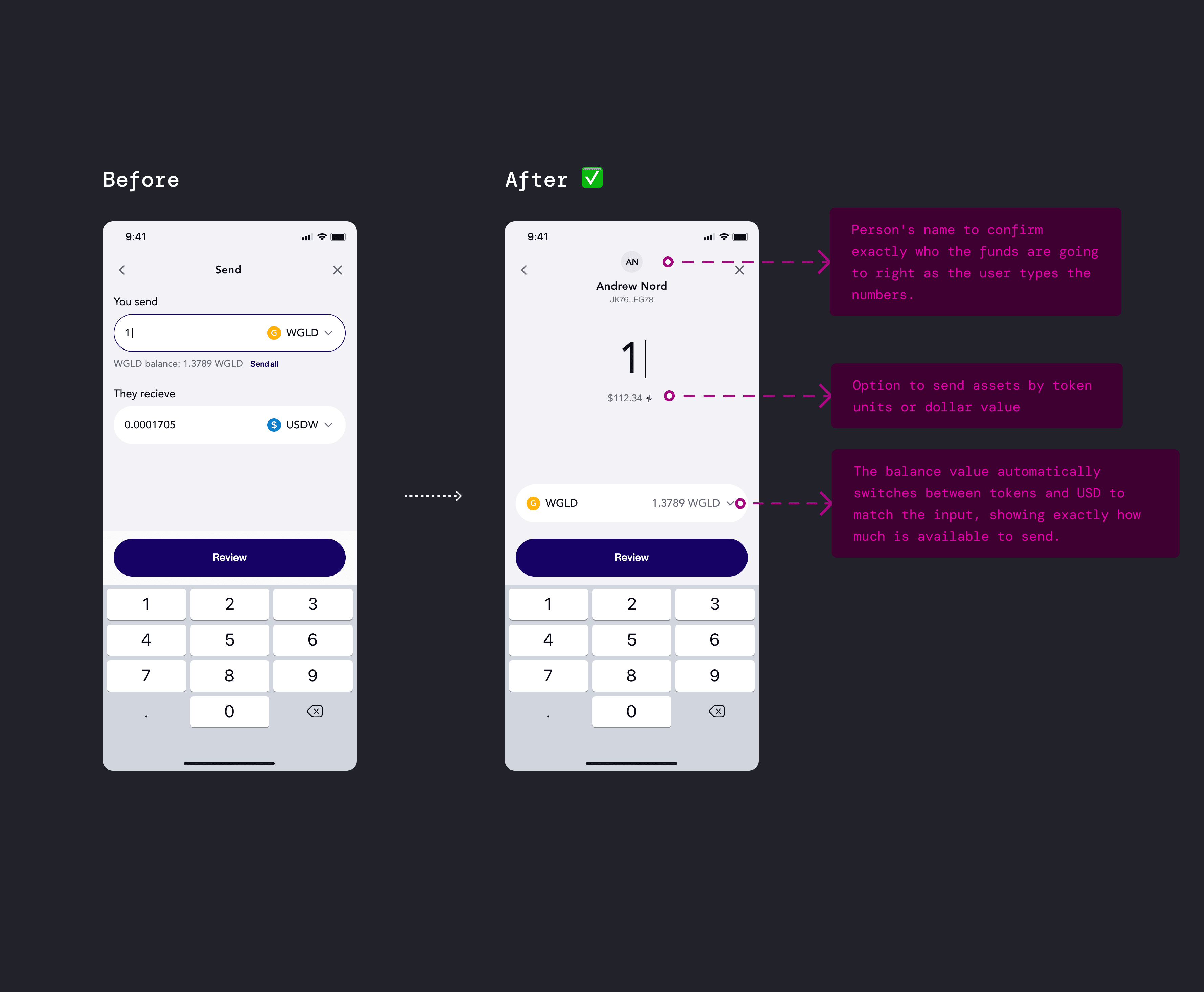
Before-after: from complex multi-currency to a streamlined single-asset flow
Impact
We launched WisdomTree Prime across 21 US states, making WisdomTree the first ETF provider to enter the digital asset space with a direct-to-consumer product. This opened a new revenue stream and customer segment. And for our company, the project helped secure $17M in additional funding and validated our ability to ship complex, regulated fintech products in the blockchain space.
Reflection
For me, it was a great opportunity to lead design efforts of the product that blends traditional banking with digital asset worlds. This project reinforced a core principle: the best way to introduce complex technology isn't to explain it - it's to hide it. By centering user needs and building around what people actually want, we created something they cared about.
The simplified omni-field prioritized a clean look over the need for quick access to frequent contacts.